
Everything Has to Earn its Place: Inside the Brand Design
Let’s geek out on design a little.
There’s a lot of thinking behind how BOXBOX looks. The colors, the typefaces, the way six letters sit together. Some ideas inspired by engineering, some science and others from Formula One. These worlds are full of amazing design, and plenty to build on.
We started with what we wanted to communicate. The science behind the product. The consideration and engineering behind the system. The reassurance of having what you need and being ready for whatever comes next. A product that is not only satisfying to use but also integrates into your life seamlessly. We built the design system around those ideas.
One rule runs through all of it: everything has to earn its place.
For us, that means a big part of the design process is taking things away. The challenge becomes knowing when to stop, when what’s left provides the utility we need with nothing that doesn’t.
Color
Our main palette is mostly black and almost white. That being said, I’m not a huge fan of stark versions of either, they can feel a little cold and clinical. So we moved slightly inward: a dark charcoal and a white with just a touch of gray.
Our white came with a nice discovery. While experimenting within a narrow range of shades, I noticed a pattern in the hex codes: an F followed by a number, repeated three times. So I thought, why not. I typed in #F1F1F1, and sure enough, that was the shade.
A tiny connection to the world we’re entering, hiding in a color code. The shade worked beautifully, and the coincidence made it an easy choice.
A detail almost no one will ever see, but a cool little connection for those in the know.
Formula One gave us plenty to explore, but one thing that really stands out is color. Color is such a strong part of how teams become recognizable. An F1 fan will know exactly which team I’m talking about when I say Papaya, Scarlet Red, or British Racing Green. So, I spent time looking through historical liveries to see what might feel right for BOXBOX. There was plenty of inspiration to draw from but one stuck out as right. A blue inspired by the Leyton House-liveried March 881, which raced in 1988.

To me, that blue feels clean and calm, and at the same time almost electric. Calm in the moment, yet ready for energy. That combination felt fitting for a personal care system built around people on the move.
It also works beautifully against charcoal, off-white, aluminum, and the natural materials we’re considering for packaging. Those relationships mattered. The color not only had to work wherever we put it but it had to come alive just like with a Formula 1 car.
We use it as an accent. A little can do a lot: draw attention to an action, give a layout some spark, bring energy into the packaging. We’re considering it for the dispensing button, where that visual energy would have a very literal job of highlighting an action. And let’s be honest about how these color indicators can make us feel. The GO-BABY-GO button on Eleanor’s shift knob would be way less exciting if it was a neutral color. But it’s bright red, and that by itself is exciting. The NOS doesn’t hurt though.
Anyway, our neutral shades give us the foundation we need while the blue finds the moments to come alive.
Our typography takes a different approach.
DIN is our primary typeface, carrying most of the communication. Its history in standardized lettering for technology, engineering, and transportation is part of what drew me to it. There’s a practical purpose behind those letterforms, and that feels fitting for a brand thinking carefully about engineering and establishing a new standard in personal care.
I like that connection between what the typeface was designed to do and what we’re trying to communicate. Its utility is already part of its character.
For smaller accents, we’re adding Grilli Type’s Pressura Mono: labels, ingredient lists, buttons, links. I think of these as the annotations around an engineering drawing. The little details that actually do quite a bit of heavy lifting.
To my eye, Pressura feels related to DIN, even though they’re separate families. Its geometry feels at home alongside our primary typeface, while the monospaced structure adds a scientific, technical quality.
That’s how it earns its place. It gives us a little extra flavor within the same visual language. A small label or ingredient list can carry a little added personality without the visual identity becoming busier.
Then there’s the logo, where we wanted to create a little curiosity.
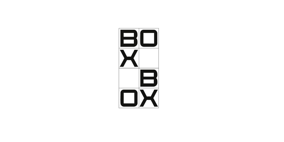
BOXBOX comes from the pit-stop call. But the name also made me picture a grid. Almost like the top view of the starting grid, but tighter, neater, like drafting paper. I started drawing those boxes and arranging letters inside them, eventually working within a grid two columns wide and four rows tall.
The lettering is custom, with inspiration from Eurostile’s geometric, technical feel. The grid disappears in the finished logo, but its structure remains.
We wanted to avoid the familiar horizontal wordmark from the outset. Thinking ahead to a potential place among sponsor logos on an F1 car, the mark needed a distinctive shape. Something you might recognize before you’ve fully read it.
The process was about arranging the six letters within that grid until we found the balance: readable enough to understand, and intriguing enough to invite a second look.
You see a grouping of letters and start putting them together. There’s a sequence you can follow, even though the arrangement is unconventional. My hope is that the small moment of figuring it out helps it stay with you. But it still needs to resolve relatively quickly, especially in a racing context.
For horizontal applications, we simply rotate the entire mark ninety degrees. Yes, the letters are now on their side. It’s unconventional, but it definitely invites a second look. On its side, it almost becomes a geometric symbol, before it makes you turn your head for a better read of it. But the point is you’re still looking, surrounded by a sea of sans serif words that you’ve likely already forgotten.
Our broader process involves designing, taking things away, and sometimes putting a little back. We keep asking what each choice contributes, until what remains feels the most deliberate.
Every detail has to earn its place.